PayPo is a fintech whose first product is deferred payments. It’s all summed up in its charmingly concise slogan: “You buy, but you don’t pay. Because you pay later.” We try to bring that same simplicity and accessibility to everything we do for PayPo.
Our work
PayPo
PayPo
Brand experience for a buy now, pay later service
Client
PayPo
Scope of work
rebranding, brand identity, UX/UI, wireframes, graphic design, CX design, frontend development
Technologies
Lottie, React.js
About the client
Challenge
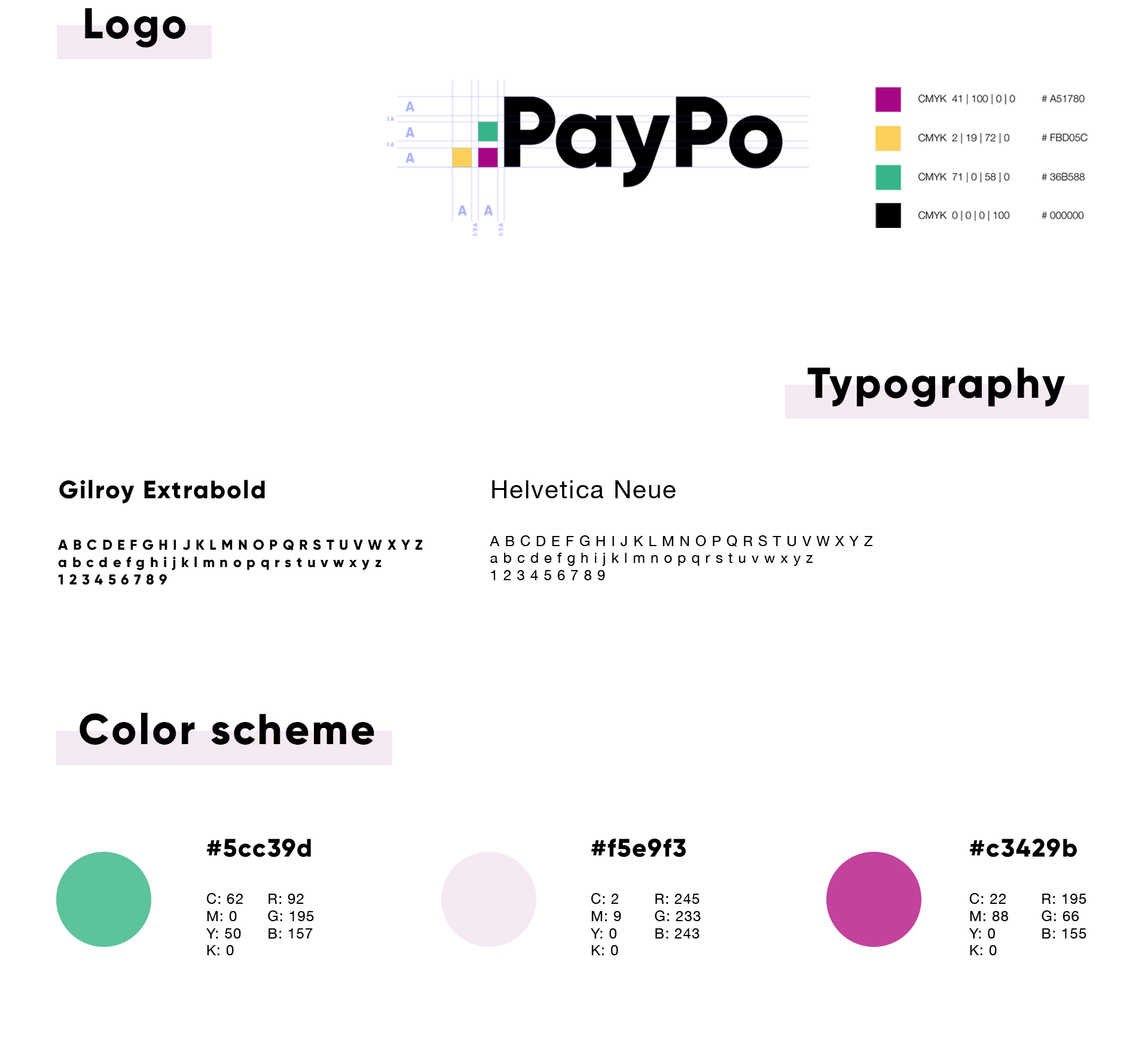
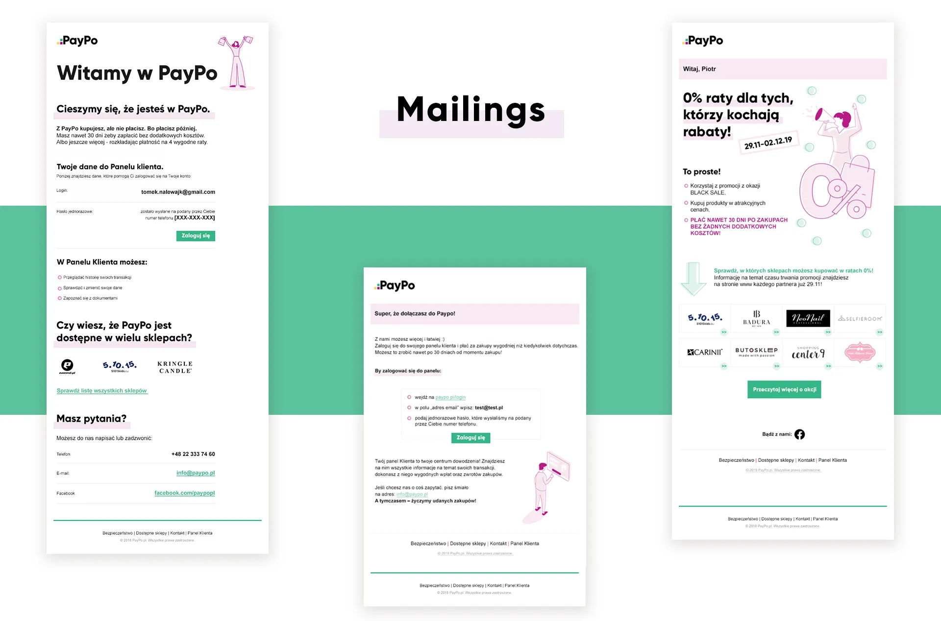
An approachable, helpful brand stands out against the stiff, predictable image of other financial services. PayPo goes for a direct, light tone of voice, so it needed a consistent, unconventional visual identity.
Process
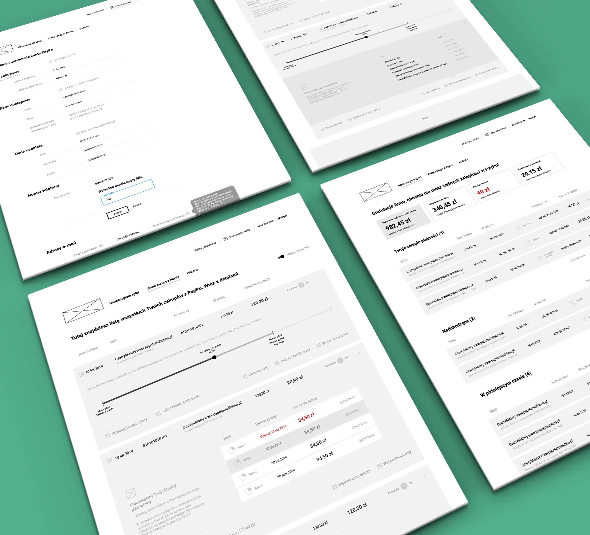
We work hand in hand with the client, constantly exchanging feedback. We started by analyzing the PayPo user’s purchase journey and touchpoints with the service, and then defined what the information should look like at each stage.
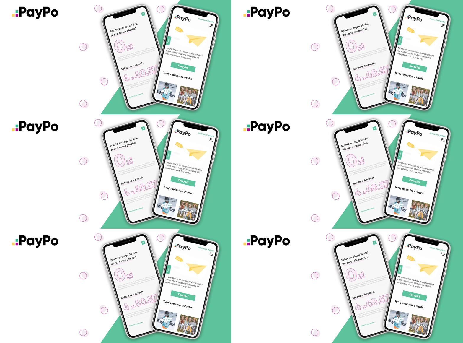
We designed lo-fi wireframes, prepared the graphics and coded the service’s interface. We went for a modern style (typography and illustrations) and built the website animations on the Lottie library, which makes the site lighter and clearer.
Solution
The collaboration resulted in a consistent, unique visual identity that stands out in the financial industry. Users get clear information about the next steps, don’t feel lost and can be sure they’re dealing with a “human” and reliable service.