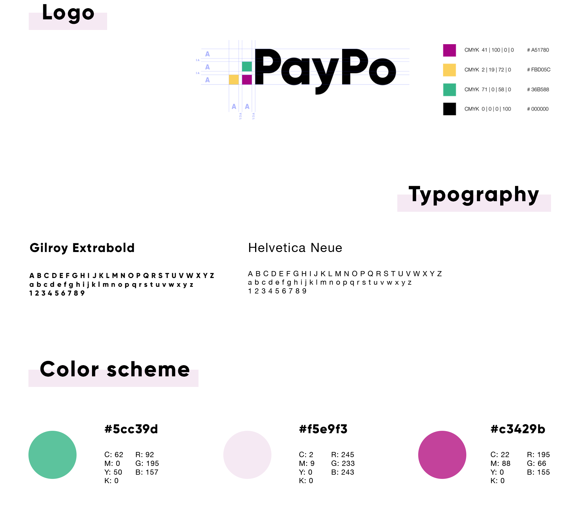
PayPo
Brand experience for the deferred payment system
CLIENT
PayPo
WHAT HAS BEEN DONE
rebranding, brand identity, UX/UI design, wireframes, graphic design, CX design, frontend development
TECHNOLOGY WE USED
Lottie, React.js
DATE
July 2018 - Ongoing
PayPo is a fintech whose first financial product is deferred payments. It’s expressed in their charmingly concise slogan: You buy, but you don’t pay. Because you pay later. We try to incorporate this simplicity and accessibility into our activities carried out for PayPo.
The Challenge
Being accessible and helpful for users, the company stands out from rigid and predictable brands of other financial services. In contacts with users, PayPo focuses on a direct, light communication, that is why it needed a coherent, unconventional graphic identification.
The Process
We work on the project together with the client, constantly exchanging comments and ideas, creating an image of an accessible and friendly brand. Our overriding goal was the convenience of the user.
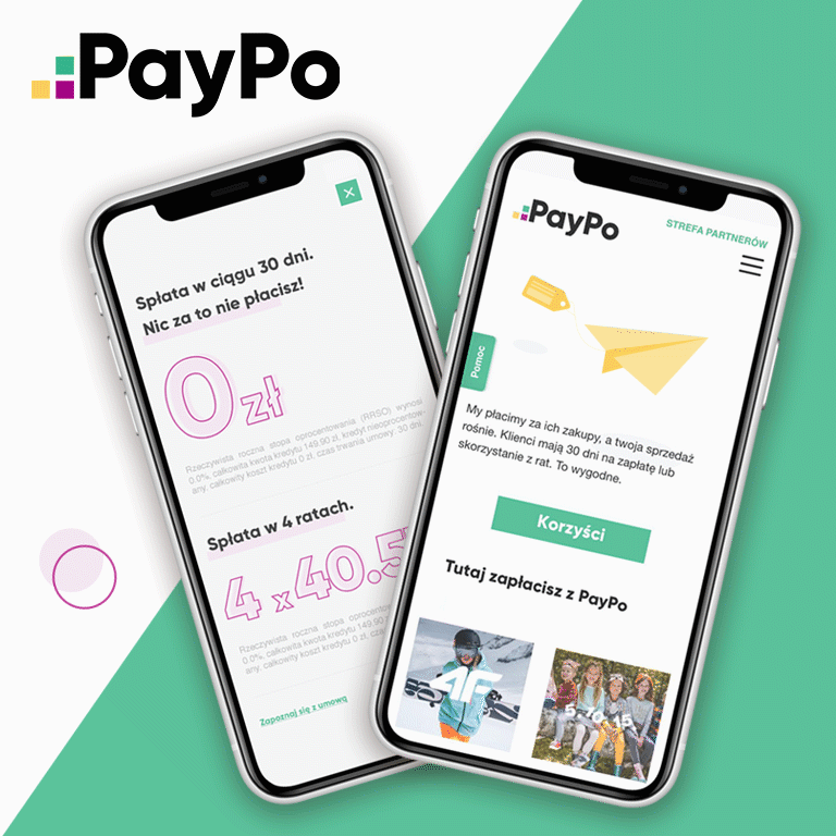
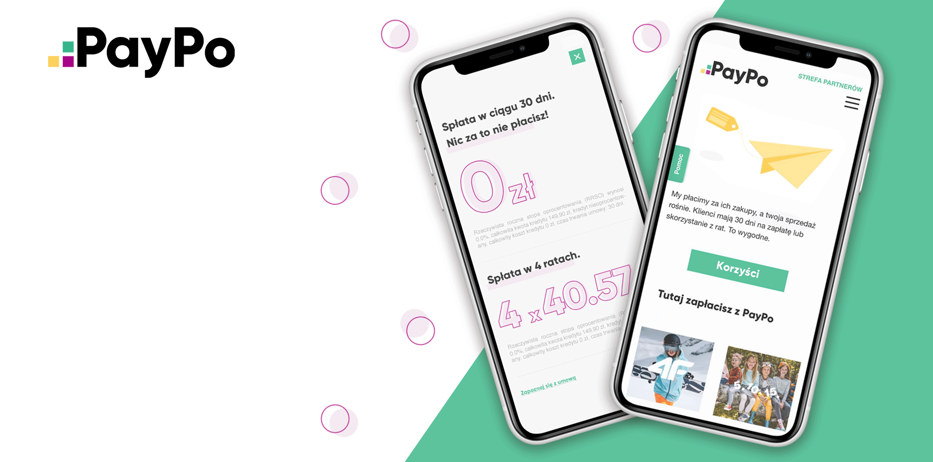
We started with an analysis of the PayPo user’s purchasing process. We have distinguished the points at which the user gets in contact with the service and figured out what the information provided at each stage of the service should look like.
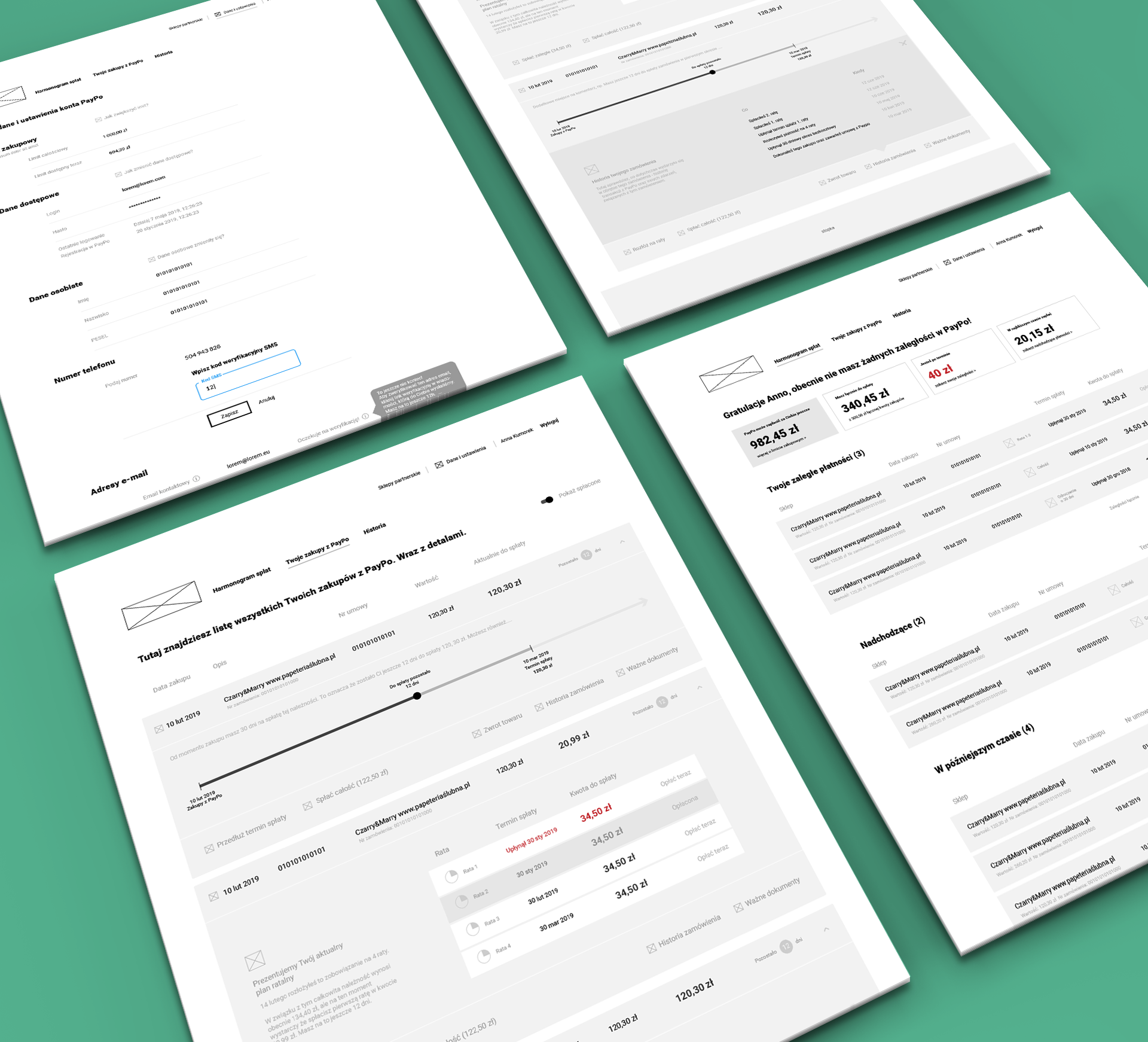
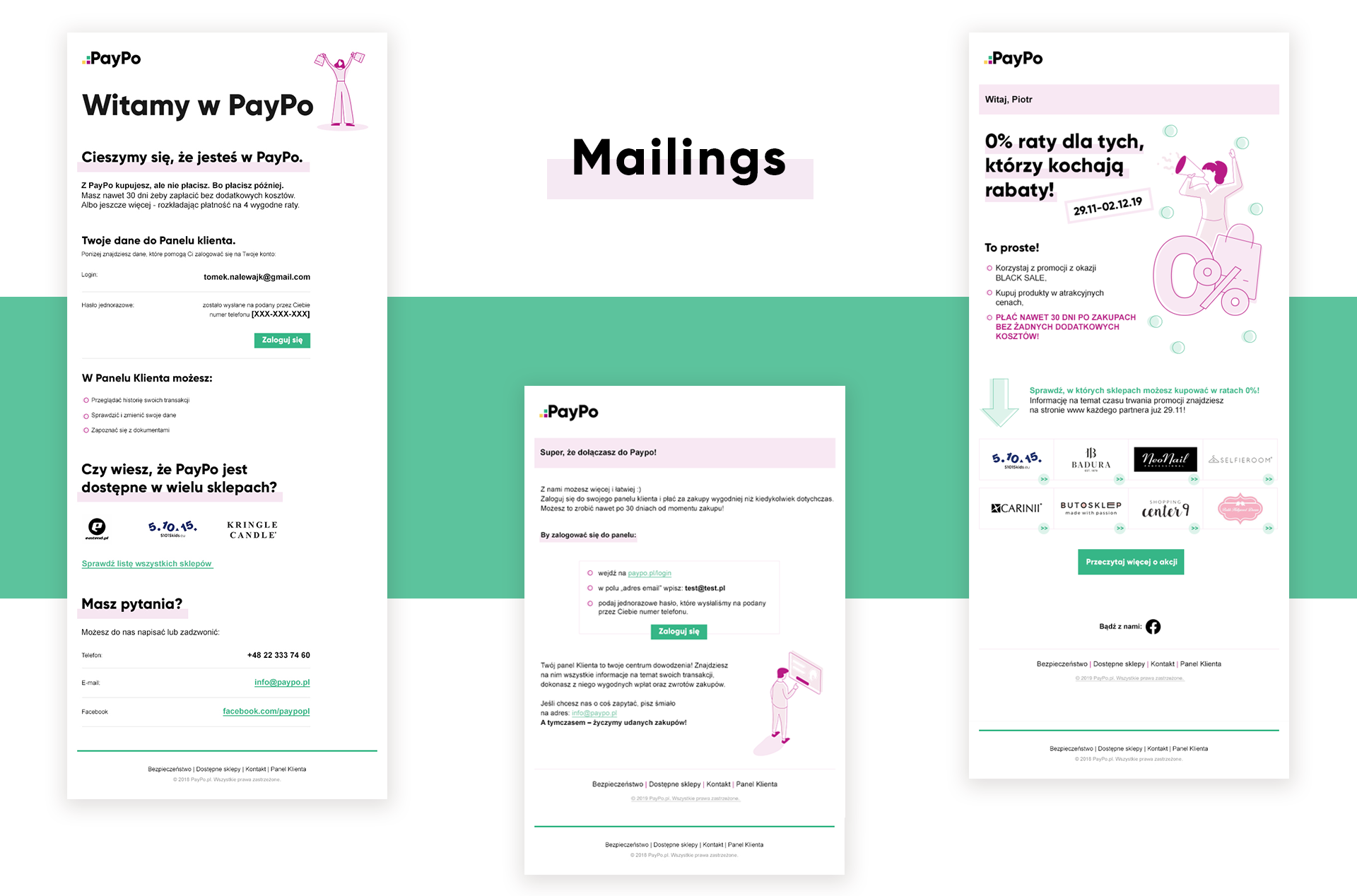
We designed lo-fi prototypes, prepared graphics for implementation and then coded the service interface. We have opted for a modern graphic style (typography plus illustrations), maintaining clarity and hierarchy of information.
For the animations on the website we have used the Lottie library (these are not ordinary gifts, but objects animated with code), thanks to this the website is lighter and clearer – just like the brand’s communication 😉
The Solution
Our cooperation has resulted in a coherent and unique visual identification that stands out from other services in the financial industry. When shopping, the users receive clear and transparent information about the next steps of the process, so they do not feel lost or frustrated. Instead, they feel satisfaction and confidence that they are dealing with a reasonable and reliable service. We are also pleased to co-create such a brand.